Project 5: Logos

HeatherSerranoP5Logos

  1. Description: This is a logo for a company called Mystery House, a place you go to solve mysteries for fun.
  2. Process: First I had to come up with an idea. When I decided on a company to create a logo for, I thought of a couple different ideas that could work for a logo. I created three completely different logos in Adobe Illustrator. Next, I got some feedback from a couple different people, and asked twelve different people which one was their favorite. Once I had gotten the feedback, I went with the logo that people liked the most and I refined it, mixing some of my ideas together.
  3. Message: This is a logo for a mystery house. This is a place you can go where you play a game. There is a time limit and you usually only have 1-2 hours to solve a mystery. It is like a real life Clue board game.
  4. Audience: This is meant to appeal to people that like to solve mysteries and play games.
  5. Top Thing Learned: I learned that vectors act between points and raster uses pixels, which is pretty neat.
  6. Color Scheme and Color Names: I really only used black and a dark purple, so monochromatic. Except for the middle one, which is black and gray.
  7. Title / Body Font Names & Categories: I titled the paper with Palatino, Oldstyle. The name of the company on the logos is OCR A Std, Sans Serif.

Project 4: Montage

P4HeatherSerrano

  1. Description: This a spiritual montage meant to strengthen and comfort people.
  2. Process: I searched a couple of images on google and used them in Photoshop to create this montage. I used masking different levels of opacity to blend Christ into the the background picture, then I chose a scripture and used some varied fonts.
  3. Message: I wanted to show that Christ is always there watching over us and that he cares about us and will never leave us.
  4. Audience: The audience for this project is everyone who has ever felt alone or lost.
  5. Top Thing Learned: I learned how to use masking to blend two images together, which is pretty neat.
  6. Filter / Colorization used and where it was applied: I enhanced the colors on Christ’s face and used the sharpening tool.
  7. Color scheme and color names: This is the a complementary color scheme with red and green.
  8. Main Body Font Name & Category: Myanmar MN Regular, Sans Serif
  9. “I am with thee” Font Name & Category: Myriad Pro Bold Italic, Sans Serif
  10. “I am with the” and “Genesis 28:15” Font Name & Category: Nuptial BT Regular, Script
  11. Thumbnails of Images used:Red-Tree-Autumn-Nature-Images-Wallpaper-HD-Widescreen-4278389292VRL_74520_7737218
  12. Sources (Links to images on original websites / with title of site):

    1. Tree Image: Found at MoshLab Wallpaper. http://moshlab.com/red-tree-autumn-nature-images-wallpaper-hd-widescreen-4278389292/
    2. Christ Image: Found at Word By Picture. http://www.wordbypicture.com/why-jesus-christ-important-life/___bGRzKm9yZ3x5b3V0aHxiY3x5b3V0aHxsZWFybnx5d3xnb2RoZWFkfGltcG9ydGFudHxpbWFnZXN8Z29kaGVhZC13aHktaXMtamVzdXMtY2hyaXN0LWNvcHkqZ2lm_cGVsYXV0cypjb218bGRzfGxkcy1jbGlwYXJ0LWplc3VzLWNocmlzdCpodG1s/

Project 3: Photodesign

P3HeatherSerrano

  1. Description: This project is meant to show some of my photo design skills in Photoshop with a picture that I took.
  2. Process: First I took some pictures with a camera that I rented from the library. I took several pictures and with this picture I was going for a foreground focus. When I decided on this picture, I used Photoshop to make this design.
  3. Message: I designed this picture with people that enjoy nature in mind. I used a quote by the poet Robert Browning, and he is encouraging people to trust that nature will run its course.
  4. Audience: I made this for people that love nature.
  5. Top Thing Learned: I learned that it can be kind of tricky when printing things in Photoshop.
  6. Color scheme and color names: The color scheme I chose was a big split complementary with the colors green, purple and brick.
  7. Body Font Name & Category: Swiz721 BlkOul Bt, Sans Serif
  8. Color Swatches Font Name & Category: Myriad Pro, Sans Serif
  9. Thumbnail of original, unedited image inserted:IMG_0370
  10. Date and location you took the photo: Oct. 13 at 10:15 a.m.

Project 3 Activity: Photography

Lighting 1: Outdoors
Lighting 2: Indoors
Lighting 2: Indoors
Focus 1: Foreground
Focus 1: Foreground
Focus 2: Background
Focus 2: Background
Composition 1: Rule of Thirds
Composition 1: Thirds
Composition 2: Leading
Composition 2: Lead Room

For this project, I went and rented a camera from the library. I do not really have any experience with photography other than pointing and clicking. I’ve always thought my photos would turn out pretty okay, but then again, I’m not really the picky type. I soon realized that good lighting is hard to come by, and sunny days don’t necessarily make for the best lighting. The sun casts so many shadows.

I enjoyed my little photographing excursion. The first two photos are concerned with lighting, both inside and outside. The second two have to do with focus. So I took the same picture twice, just with two different focal points: the foreground and the background. The last two, I tried to incorporate the rule of thirds and then leading. It was a good experience and I enjoyed it.

Project 2 Event Ad

P2HeatherSerrano

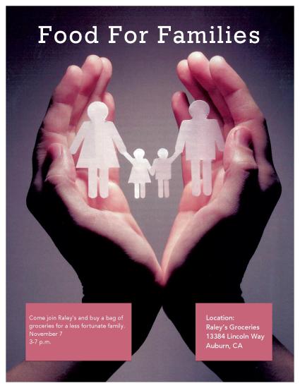
Description: This is an event ad for people to go and buy a bag of groceries for a less fortunate family.

Process: First I scanned an image from a magazine and made sure to scan it at a high quality of 300 pixels per inch. Then I used the image as the background for my event add. I created a document in Microsoft Word 2011 and went on to create the title and the text boxes.

Message: This is an invitation for people to make a difference and help a family in need by buying them some groceries.

Audience: I tried to make this event ad target families. In particularly, parents.

Color Scheme: This color scheme is a red monochromatic.

Top thing Learned: I learned the importances of aligning the text and text boxes.

Title Font Name and Category: GeoSlb712, Slab Serif

Copy Font Name and Category: Avenir Medium, Sans Serif

Scanned Image Used: I scanned this image from a church magazine. It was the August 2015 Ensign. I used a scanner from the printing center at my school. Originally the image was 8.5 by 11 inches.

Original Scanned Image:large

Project 1 Flier

HeatherSerranoInDesignFlier

  1. Description: This is a black and white flier to invite graduates to a leadership conference.
  2. Process: First, I sketched a few designs. Then I chose one designed it in Adobe InDesign. I used repetition of the black boxes to tie it together and alignment of the paragraphs and logo to keep it in order.
  3. Message: I am trying to reach recent university graduates to invite them to come to a conference to improve their leadership skills.
  4. Audience: Recent graduates from 22-26 years of age.
  5. Top Thing Learned: I learned that the value between the black and white creates a nice contrast.
  6. Title Font Name & Category: Trajan Pro from the Oldstyle category.
  7. Copy Font Name & Category: Gill Sans from the Sans Serif category.
  8. Links to images used in this project:
    1. https://130.commbyui.org/wp-content/uploads/2013/01/JuliePeterson-Leadership-conference-business-rexburg-Idaho_7576-as-Smart-Object-11.jpg
    2. https://130.commbyui.org/wp-content/uploads/2013/01/VouantLogo3.png